| 일 | 월 | 화 | 수 | 목 | 금 | 토 |
|---|---|---|---|---|---|---|
| 1 | 2 | 3 | 4 | 5 | 6 | 7 |
| 8 | 9 | 10 | 11 | 12 | 13 | 14 |
| 15 | 16 | 17 | 18 | 19 | 20 | 21 |
| 22 | 23 | 24 | 25 | 26 | 27 | 28 |
- 캡슐화
- JavaScript
- js
- REACT
- 부트캠프
- OOP
- 타입스크립트
- 노마드코더
- 불변성
- 프론트엔드
- 리액트
- typeScript
- frontend
- CSS
- 클래스
- 논리연산자
- 자바스크립트
- Zustand
- 자바스트립트
- 웹개발
- 추상화
- 패스트캠퍼스
- Props
- webdevelopment
- Fetch
- 상속
- 투두앱만들기
- 객체지향프로그래밍
- github
- Hooks
- Today
- Total
connecting dots
HTML/CSS 3회차 | CSS 기초, flex, grid, 미디어 쿼리, CSS 네이밍 방법론, css framework 본문
HTML/CSS 3회차 | CSS 기초, flex, grid, 미디어 쿼리, CSS 네이밍 방법론, css framework
dearsuhyun 2024. 6. 15. 15:29
사이트
webpack
webpack is a module bundler. Its main purpose is to bundle JavaScript files for usage in a browser, yet it is also capable of transforming, bundling, or packaging just about any resource or asset.
webpack.js.org
flex
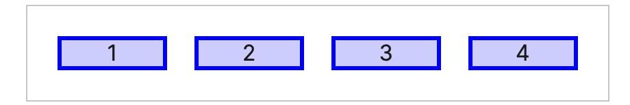
<div class="container">

  <div class="box">1</div>
  <div class="box">2</div>
  <div class="box">3</div>
  <div class="box">4</div>
  <div class="box">5</div>
  <div class="box">6</div>
  <div class="box">7</div>
div {
  font-size: 20px;
  border: 1px solid gray;
}

.container {
  display: flex;
  background-color: red;
}

.box {

  background-color: white;
}
flex(flex-grow, flex-basis, flex-shrink의 축약형)
flex-grow : 남은 영역이 있으면 그것을 각각 자식들에게 나눠 줄거야 (커질 때 얼마나 커질건지)
flex-shrink: 축소. 자식을 배치할 공간이 부족할 때는 자식 크기를 줄여야 함. 줄이는 비율
--> 알아서 줄이거나 키워줄게 ! flex
flex-basis: 아무것도 안 했을 때 자식요소 크기 (default = 0)
div {
  font-size: 20px;
  border: 1px solid gray;
}

.container {
  display: flex;
  background-color: red;
}

.box {
  flex: 1;
  background-color: white;
}
flex의 합은 7, 각자가 flex:1 로 1개씩 가지니까 똑같은 크기로 !

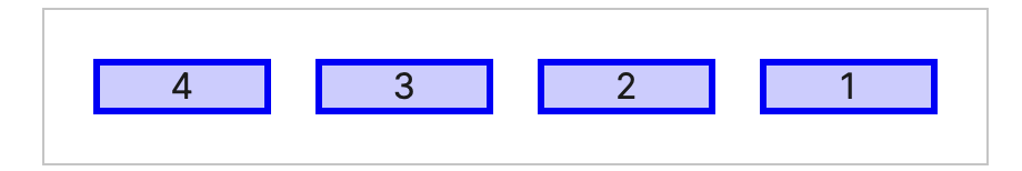
direction
flex-direction: row; 수평
flex-direction: column; 수직

flex-direction: column-reverse;
direction: ltr;
direction: rtl;
정렬 (justify-content)
https://developer.mozilla.org/ko/docs/Web/CSS/justify-content
justify-content - CSS: Cascading Style Sheets | MDN
CSS의 justify-content 속성은 브라우저가 콘텐츠 항목 사이와 주변의 공간을 플렉스 컨테이너에서는 main-axis, 그리고 그리드 컨테이너에서는 인라인 축을 기준으로 어떻게 정렬할 것인지를 정의합니
developer.mozilla.org
main 축을 기준으로 정리됨
main --> direction이랑 같음
cross(교차축) direction의 반대
align-items: stretch, center, start, end;
https://developer.mozilla.org/ko/docs/Web/CSS/align-items
align-items - CSS: Cascading Style Sheets | MDN
CSS align-items 속성은 모든 직계 자식에 대해 align-self값을 그룹으로 설정합니다. 플렉스박스의 교차축을 따라 아이템을 정렬합니다. 그리드 레이아웃의 그리드 영역내 블록 축을 따라 아이템을 정
developer.mozilla.org
grid
https://developer.mozilla.org/en-US/docs/Web/CSS/grid
grid - CSS: Cascading Style Sheets | MDN
The grid CSS property is a shorthand property that sets all of the explicit and implicit grid properties in a single declaration.
developer.mozilla.org
미디어 쿼리
조건 유형 학습하기 (width, orientation 등)
https://developer.mozilla.org/ko/docs/Learn/CSS/CSS_layout/Media_queries
미디어 쿼리 초보자 안내서 - Web 개발 학습하기 | MDN
CSS Media Query는 예를 들어 "뷰포트가 480 픽셀보다 넓다."라고 여러분이 지정한 규칙에 브라우저 및 장치 환경이 일치하는 경우에만 CSS를 적용할 수 있는 방법을 제공합니다. 미디어 쿼리는 뷰포트
developer.mozilla.org
@media media-type and (media-feature-rule) {
  /* CSS rules go here */
}
페이지가 인쇄된 경우에만 본문을 12pt로 설정
@media print {
  body {
    font-size: 12pt;
  }
}
미디어 쿼리 테스트 사이트
Screenfly / Test Your Website at Different Screen Resolutions
screenfly.org
CSS 전처리기 (SCSS)
Sass: Syntactically Awesome Style Sheets
Sass is the most mature, stable, and powerful professional grade CSS extension language in the world.
sass-lang.com
variable
scss
$font-stack: Helvetica, sans-serif;
$primary-color: #333;

body {
  font: 100% $font-stack;
  color: $primary-color;
}
--> css
body {
  font: 100% Helvetica, sans-serif;
  color: #333;
}
Nesting(중첩)
scss
nav {
  ul {
    margin: 0;
    padding: 0;
    list-style: none;
  }

  li { display: inline-block; }

  a {
    display: block;
    padding: 6px 12px;
    text-decoration: none;
  }
}
css (중첩 지원하지 않음)
nav ul {
  margin: 0;
  padding: 0;
  list-style: none;
}
nav li {
  display: inline-block;
}
nav a {
  display: block;
  padding: 6px 12px;
  text-decoration: none;
}
Modules
scss
// _base.scss
$font-stack: Helvetica, sans-serif;
$primary-color: #333;

body {
  font: 100% $font-stack;
  color: $primary-color;
}
// styles.scss
@use 'base';
.inverse {
background-color: base.$primary-color;
color: white;
}
css
body {
  font: 100% Helvetica, sans-serif;
  color: #333;
}

.inverse {
  background-color: #333;
  color: white;
}
CSS 네이밍 방법론
BEM
보통 면접용 ? 실무에서는 잘 쓰이지 않음 (?)
BEM — Block Element Modifier
Flexible Using BEM, methodologies and tools can be recomposed and configured the way you like.
getbem.com
Atomizer
Atomizer
An unopinionated CSS utility library for modern websites.
acss.io
css framework
Ant Design - The world's second most popular React UI framework
An enterprise-class UI design language and React UI library with a set of high-quality React components, one of best React UI library for enterprises
ant.design
MUI: The React component library you always wanted
MUI provides a simple, customizable, and accessible library of React components. Follow your own design system, or start with Material Design.
mui.com
https://blueprintjs.com/docs/#blueprint
Blueprint – Documentation
blueprintjs.com
Bootstrap
Powerful, extensible, and feature-packed frontend toolkit. Build and customize with Sass, utilize prebuilt grid system and components, and bring projects to life with powerful JavaScript plugins.
getbootstrap.com
참고 사이트
State of JavaScript
stateofjs.com
'Live Class > DevCamp' 카테고리의 다른 글
| JS 6회차 | 토이 프로젝트 설명, import/export, axis, express, app.get, SQL (0) | 2024.06.16 |
|---|---|
| JS 1회차 | 식, 값, 문, 실행(run), 변수를 만드는 방법, 메커니즘, 객체의 특징, 함수를 만드는 방법 (0) | 2024.06.15 |
| HTML/CSS 2회차 | CSS 기초, box model, flexbox (0) | 2024.06.14 |
| HTML/CSS 1회차 | html 기초, DOM (1) | 2024.06.14 |
| JS 2회차 | 함수: 일급함수, 즉시실행함수, 화살표함수, 클래스, 메소드, scope, var/let/const, 복사와 참조 (0) | 2024.06.14 |

